


 by Toma Habashi
Silvertoad loves to design logos. It’s a big part of what we do. Whilst other tasks are slightly more predictable, logo design is about as abstract as the job gets for us. As everybody who cares knows, a logo is a visual shorthand for your company. It communicates your ‘vibe’.
The art of logo creation is always in a state of positive flux as businesses of all shapes and sizes make the most of engaging consumers through an increasing number of digital channels. Whilst this happens logos remain at the forefront of brand identity, perhaps even more so.
So what’s new for 2016?
Flat Designs
 Flat designs will continue to impress and not because they look clean and forthright, but because they simply look good via any online browsing device. They also load a lot faster too. Patterns, textures, shadows, gradients will give way to simpler lines and colours. As more and more people shop or use the Internet on an increasing array of applications the more we’ll encounter flat and easy to digest logos.
Handmade Designs
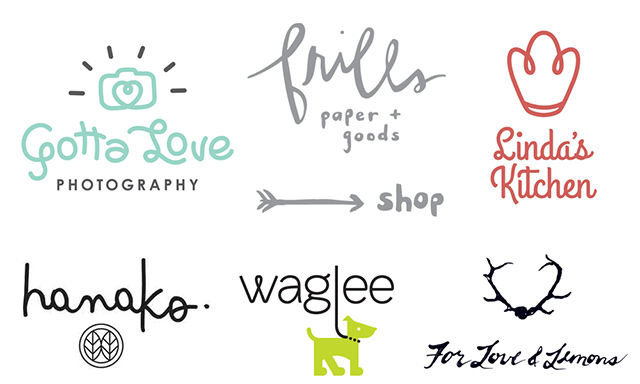 Handmade logos speak of an honesty, they somehow convey an effort to be intimate or personal. This trend has been slowly gaining ground for several years now. Such designs suggest the idea of the company it represents being a producer of handmade, bespoke fare. It’s OK to be charming too.
A handmae look is more personable and warm too, so with companies increasingly on the lookout to get closer and cosier with the consumer, this could be the way to go in some markets.
Handmade elements and font sets, or a suggestion of such, will be more evident in logo design as the year progresses. Bespoke font sets will be a valuable design asset. Typefaces will always be, a great contributor to communicating the brand’s personality.
Kinetic Logos
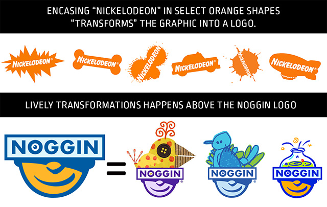
Dynamic logos, kinetic logos or logos that change-but-remain-the-same will find greater appeal. Perhaps because the style offers freshness, or it could be because the decision of what is attractive becomes even more personal, while the need to connect to as many people as possible becomes the priority.
Think of the daily changes in the Google Doodle and you will get the idea of how this growing trend both fascinates the consumer and answers the need to present something fresh on a regular basis.
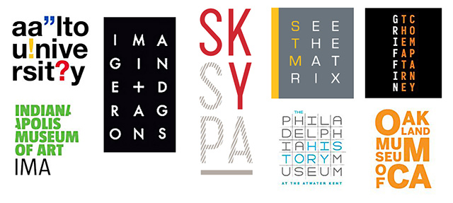
Letter Stacking
Letterstacking will continue to hold ground. This trend has been around for quite a while but is it not losing popularity. Perhaps it is because it draws in the consumer and challenges them to make sense out of it.
MonoLines
Thin lines and mono weight type additions are also very presentable and will continue to represent brands that wish to give off an air of prestige. This is the use of a line, unchanging in thickness, to design and compose the entire logo in something akin to ‘wire’.
The use of thin lines, or lines with a consistent thickness in mono scripts, mono icons and mono crests, is a lively progression of just how strong this design style has been growing over the past few years.
If you would like Silvertoad to give your company logo some revitalistation and revision please contact us. We relish this kind of work.
About Us – Silvertoad, based in Luton, Bedfordshire, provides the widest range of creative graphic design services including magazine design, production and printing.
Please contact our friendly customer services team to discuss how we can help you! Call us on: 0800 756 6800 or email us at: [email protected]