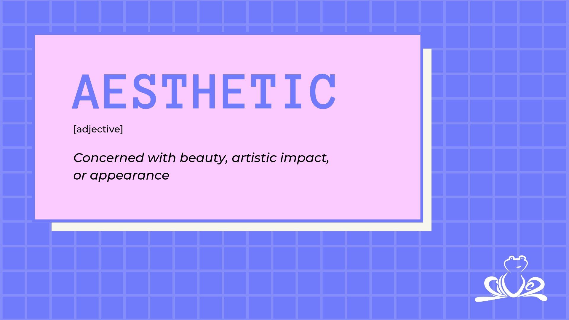
Good design and aesthetic is vital throughout your entire branding is essential. Presenting yourself properly first gives your potential clients the right impression that your business knows what it’s doing and will produce a valuable result.
The term aesthetic is mostly associated with social media and edgy hipster trends, and is the concern for beauty, artistic impact and appearance. As a design agency, we’re focused on producing practical solutions with beautiful concepts and clean design.
So what’s the secret?
We’re focused on producing beautiful, easy to use websites with a focus on user interface and the overall user experience. A common mishap we find a lot, is companies that have built themselves a site that they like based on personal opinion, not with the outlook of the end user – their prospects and customers. Here at Silvertoad, we don’t make sites that look pretty for the sake of it – we build experiences that are practical whilst looking good and ultimately suit your purpose. We prioritise website flow, branding, colours and images that create a balance of design, content and practicality, whilst being flexible to set your business apart from your competitors. For more information on our web services click here.
For our print products, we’re also focused on the visual to ensure its eye catching, flows well and is easy to read. Within this we evaluate the overall experience too, with varying paper types, lamination and feels. Here at Silvertoad, we offer many different options to suit you and your business. We have many different paper types at various weights, from uncoated, gloss to matt laminated or silk we’ll ensure to create the right impression. We also offer bespoke touches such as spot UV varnish, embossing, foil blocking and die cutting. The visual design of the product alongside the weight, texture and embellishments bring together the overall aesthetic and gives the right impression for your business. For more information on our print services click here.
The use of the term is the most popular within social media, particularly on Instagram. Though mostly used for edgy and hipster concepts, it addresses the visual appeal of your social media accounts in a very similar way to design, print and web. A main prioritisation is what platforms you use for different types of content – some platforms suit different messages better than others. We use Instagram as our social portfolio, where imagery is the most important – we use this platform to showcase our work, what we’re doing and display our products. Facebook we use as our central hub where we’re able to communicate in various ways, usually combining imagery with well written content. We tailor our posts to suit both high end and smaller businesses as well as individuals, and openly encourage discussion. Twitter we use to spread news updates and what we’re doing, usually in short but sweet snippets which invite users to head over to our website and check us out. Finally, LinkedIn we use more formally, engaging with business owners and businesses directly. Our posts on here are more high-end professional, and upkeep our bespoke approach.
If you need help boosting your social media, take a look at our packages which we can tailor to your individual needs – click here to find out more.
