

 by Toma Habashi
In today’s digital age, mobile browsing is no longer a luxury—it’s a necessity. More people than ever are accessing the internet from their smartphones and tablets, making mobile-friendliness a critical factor for any business with an online presence.
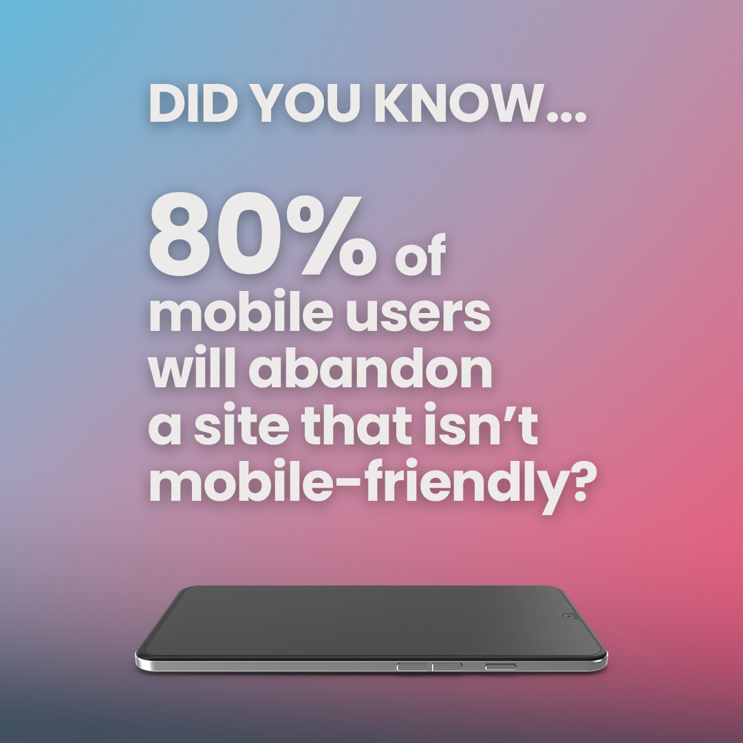
Did you know that 80% of mobile users will abandon a site that isn’t mobile-friendly? That’s a staggering statistic, and it highlights the urgent need for businesses to prioritise mobile optimisation. If your website isn’t up to par, you could be losing a significant portion of your potential audience.
What Makes a Website Mobile-Friendly?
A mobile-friendly website is designed to provide a seamless user experience on any device, regardless of screen size. This involves several key elements:
- Responsive Design: The website’s layout automatically adjusts to fit the screen it’s being viewed on, ensuring optimal readability and navigation.
- Fast Loading Times: Mobile users are often on the go and have little patience for slow-loading pages. Optimising images and code can significantly improve loading times.
- Easy Navigation: Menus and buttons should be easy to access and use on touchscreens, with clear calls to action.
- Readable Text: Font sizes should be large enough to read comfortably without zooming, and line spacing should be appropriate for mobile screens.
- Touch-Friendly Elements: Buttons and links should be large enough to tap accurately on a mobile device.
- No Flash Content: Flash is not supported on most mobile devices and can hinder the user experience.
Why is Mobile-Friendliness So Important?
Beyond the high abandonment rate, there are several other reasons why mobile optimisation is crucial:
- Improved User Experience: A mobile-friendly website provides a positive experience for visitors, encouraging them to stay longer and explore your content.
- Enhanced SEO: Google prioritises mobile-friendly websites in search results, meaning you’ll rank higher and attract more organic traffic.
- Increased Conversions: A seamless mobile experience can lead to higher conversion rates, whether it’s making a purchase, filling out a form, or subscribing to a newsletter.
- Greater Accessibility: Mobile devices are becoming increasingly prevalent in developing countries, making mobile optimisation essential for reaching a global audience.
Common Mobile Website Mistakes to Avoid:
- Slow Loading Times: Optimise images, minify code, and leverage browser caching to improve speed.
- Tiny, Unreadable Text: Use a legible font size and ensure adequate line spacing.
- Confusing Navigation: Simplify your menu and make it easy for users to find what they’re looking for.
- Lack of Touch-Friendly Elements: Ensure buttons and links are large enough to tap comfortably.
- Ignoring Mobile SEO: Optimise your content and meta tags for mobile search.
Silvertoad Can Help!
Don’t let a poor mobile experience drive your customers away. Silvertoad specialises in creating mobile-friendly websites that are not only visually appealing but also optimised for performance and user experience.
Contact us today for a free consultation! Let us help you make the most of your online presence in the mobile age.
#mobilefriendly #mobileoptimization #webdesign #seo #userexperience #websitedesign #silvertoad #mobilewebsite #responsivewebdesign